In this first part of an article series «Citymobil — a manual for improving availability amid business growth for startups» I’m going to break down the way we managed to dramatically scale up the availability of Citymobil services. The article opens with the story about our business, our task, the reason for this task to increase the availability emerged and limitations. Citymobil is a rapid-growing taxi aggregator. In 2018, it increased by more than 15 times in terms of number of successfully completed trips. Some months showed 50% increase compared with the previous month.
The business grew like a weed in every direction (it still does): there was an increase in server load, team size and number of deployments. At the same time the new threats to service availability emerged. The company faced a task of the most importance – how to increase availability without compromising company growth. In this article, I’ll talk about the way we managed to solve this task in a relatively short time.
1. Defining a task: what exactly do we want to improve?
Before improving something, we need to learn how to measure it in order to register the improvements. The closer the measurable value to the business terms, the better. In terms of its success, our most important parameter is a number of successfully completed trips (hereafter «number of trips»). This is the parameter that the investors are looking at when making a decision regarding an investment. The more trips, the more valuable is a company.
Some trips are profitable, some yield a loss. But we equally care about all the trips, even un-profitable ones since they allow the market share to increase (as a matter of fact, this loss is a payment for market share increase). Therefore, every extra trip is a good thing; and every lost one – is not. All the trips are equal in terms of business success.
Now we have an easy-to-understand availability measuring criterion: number of lost trips – these are the trips that we definitely lost due to the technical issues. By «technical issue» we mean, for example, code bug, 500 internal server error, infrastructure accident, damaged integration with our partner service (e.g. Google Maps).
2. How to count the lost trips?
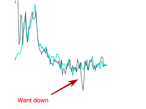
Sometimes it’s easy to count lost trips, and sometimes it’s hard. For instance, in case of total service failure, when nothing at all works (knock on wood), it’s very easy to count the lost trips. We know the trips number graph trend before the crash; we see this graph trend after the crash; we draw a line between the point when the downtime started and the point when it ended. The area of trips number graph under this completed line represents our lost trips.
In the graph below, the black line shows the trips on some day and the green one – the past week trips. At the x-axis – time. At the y-axis – number of trips at some time window around x point. You can see an obvious drop in form of an acute-angled triangle. This triangle area is the number of lost trips. Naturally, it’s an approximate number, since it’s a fluctuating graph. However, we understand that even 10-20% precision is enough to evaluate the magnitude of accident for the business.

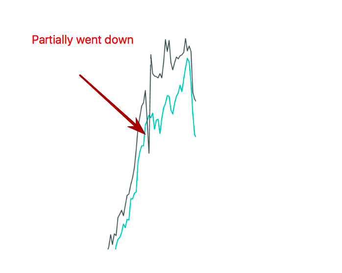
If the downtime is not total but partial (still – knock on wood), the evaluation is a bit more complicating. For example, if there is a bug causing the situation when 10% of orders not being distributed along the vehicles, then in the trip graph we see a ravine and then rebound (after the bug was fixed). In this situation, the lost trips are represented by the area separated by the trend line on top, the actual trips number graph at the bottom, the downtime start on the left and the downtime end on the right.
As seen in the graph below, the down peak isn’t that evident, but the number of trips during the previous week without down peaks helps understand that this down peak means loss. In fact, comparison of trips during the day and to the same day last week makes it clear that the rightmost down peak doesn’t show lost trips, but a common ravine for that time of day, since it’s correlated to the previous week.

A trend line is generally hard to build, since it’s a sawtooth. This is when week-to-week comparison comes in handy. If we draw two lines in the same graph – past week and current, we see that both curves are almost similar, and the only difference is that one is located above the other (usually the current week is higher than the previous one; though exceptions do happen). Week-to-week comparison is quite important as every day of the week due to various reasons has a different graph shape. When we look at the week-to-week graph, we can tell the location of today trips trend line.
Obviously, a lost trip on its own presents a much bigger problem than just one lost trip. A client that needs a ride will find a way to go; for example, she can use a competitive service and won’t come back to us later. Or she will, but only after getting disappointed with our competitor which is unlikely as our competitors are strong. More than that, even if the competitor disappoints the client, it’s not given that the client decides to return to us: she’ll believe that everybody has a bad service and there’s no point in switching from one service to another.
Therefore, one lost trip due to technical issues means, in fact, several lost trips.
To not get confused in terms, let’s call the trips lost due to actual technical problems, primary lost trips; and the trips lost due to a client leaving us for our competitor – secondary lost trips.
Ideally, to estimate the total business loss from one primary lost trip we need to figure out how many secondary lost trips it generated. So, we need to multiply a number of primary lost trips by some K coefficient that can be calculated based on average service usage rate and average time needed by a client to return after leaving us for our competitor.
Assuming that K doesn’t change much with time, it’d be sufficient for us in order to understand the trips loss trend to count the primary lost trips since the period-to-period correlation between primary lost trips will be the same as period-to-period correlation between secondary lost trips. Example: if we lost 1000 primary trips last month, then we lost 1000*K secondary trips and 1000*(1+K) in total. If, again, we’ve lost 500 primary trips this month, then we lost 500*K secondary trips and 500*(1+K) in total. That said, despite K coefficient value we now lose 1000*(1+K) / (500 * (1+K)) = 2 times less trips.
Even if K coefficient changes with time (being a function of time: K(t)), we are still interested in lowering the number of primary lost trips. For if K(t) grows with time, we definitely have to make effort to lose fewer primary trips since the financial loss caused by each and every one of them is getting bigger and bigger. On the other hand, if K(t) decreases with time it means that for some reason our users are getting more and more loyal to us which means that we absolutely must live up to their expectations!
To sum up: we are striving to decrease the loss of primary trips. In the next part, I’m going to talk about how our process works, and what we’ve done to improve it. Stay tuned!
Автор: danikin
