A few months ago I came across a very interesting documentary series on Netflix called Abstract, they basically explore the output of professional designers from different sectors like architecture, graphic design, fashion, … in their workplaces.
It was easy to spot some similarities in the work of designers from other fields with that of an iOS developer who implements user interfaces. For example, when a designer is creating something that is big enough to be broken down into smaller parts, using a strategy like ‘Divide and Conquer’ is key to being able to focus on smaller parts that will be assembled at later stages in the process.
Breaking down a whole design into smaller subunits allows us to think about each problem in isolation, removing any dependencies between the components. But the full picture also needs to be present throughout the whole process, otherwise there can be problems when the time comes to fit everything back together.
On the other hand, while watching Abstract I noticed that in the design process for objects like a shoes, banners or buildings the final design remains fixed for the lifetime of the product. The design of a Nike shoe isn’t going to change after it is released and there aren’t going to be any updates once it’s on the shelf in the shop. Sometimes a design remains unchanged even 20 years later, and the product is still sound.

Nike Air Max ’97 — Empire State Building (New York City)
Many iOS developers spend a lot of time creating interfaces, defining interactions and polishing UI details as part of the process of building large and complicated applications. It is necessary to keep in mind the big picture of the app as a whole, of course, but it’s equally important to be thinking about how to keep all the smaller components separate and distinct — as these small components can often be reused later when building other elements of the app.
In the iOS team in Badoo we have releases on weekly basis, all of which include many new features, improvements and other changes that affect the user interface. It’s always our aim to move fast and to release features of the highest possible quality, but one year ago we identified some problems in our user interface development process, and we came up with a plan to fix it.
Problem description
I’ll try to define the problem in just one sentence:
The iOS team had no clear UI development process.
What did this mean in practice? It meant that developing any new feature with user interface changes in the iOS app could lead to all sorts of problems. Here are the most common issues that we were facing on daily basis:
- Communication with designers was neither clear nor effective. There was little transparency with designers around the existing UI components that we had implemented in the apps. This forced them to create new components that look very similar to the existing ones.
- There were no generally accepted patterns for the implementation of UI components. Each developer was implementing components in different ways and many of them weren’t fitting together well.
- Code duplication was leading to significant architecture problems, adding cyclomatic complexity, amongst other problems.
- It was always very difficult to apply modifications across the whole application for the same component.
- There was a higher risk of introducing regression into existing components unless their modifications were not covered by the tests.
There was going to be no magic wand for solving these problems because it’s about process. Changing the way things are done requires alignment between different teams and convincing people affected by the process about the benefits of a new way of doing things.
‘Divide and conquer’ can be a handy approach here, starting with small issues, isolating each problem, and then beginning to build a global solution step by step. In this article I’ll explain how we achieved it!
UI frameworks
We approached the problem by starting from the foundation. The first issue to address was code duplication, we needed to unify our components and get them all in one place.
Our solution was to build a couple of frameworks, which we named BadooUIKit. The idea was that this would hold all the UI components, similar to what Apple do with UIKit. It contains classes that represent the user interfaces of one specific application (there are some other applications in our company but this specific UIKit contains only user interface components that are specific to the Badoo app).
Every application has a different colour palette, fonts, margins, etc… so it helps to have an app-specific framework in order to add stylesheets for the application within the framework as well.


What happens with UI components that can be shared and reused in different applications?
For this, we created another framework named Platform_UIKit. This framework has all the generic UI components that can be used in different apps.
Did we migrate all the UI to the new framework straight away?
No, that would have been a huge task. Instead we decided to build every new piece of UI inside the new framework and only tried to move existing components when it was affecting our current task. In some cases, a component could have many dependencies and would therefore be difficult to move from the main application to the framework. In those cases we generally opted to perform the migration task separately. As part of the initial plan we prioritised basic elements like fonts, colours, buttons, etc…
Later on, once the foundation was built we migrated the whole user interface for our chat to a UI framework as well. We did it sometime after we had the infrastructure in place and it helped to have a smoother migration process.
Side note:
If you are curious about the process of creating one of those components, please have a look at this great article by my colleague Valerii Chevtaev
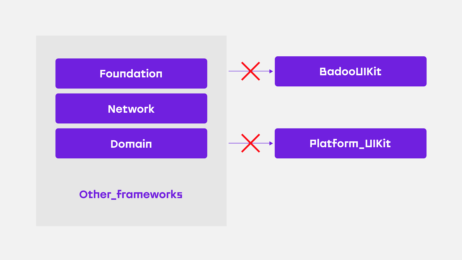
One very important requirement for these frameworks is that they must not depend on other frameworks or classes that are not strictly user interface code. For example, we never import models from the main application, networking layer related classes, statistics reporters, etc…
By isolating the UI from other dependencies we make the components as reusable as possible:
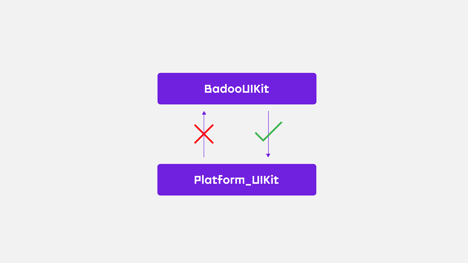
It’s fine for BadooUIKit to import from Platform_UIKit, but not the other way around, for one simple reason, if Platform_UIKit depends on BadooUIKit it will no longer be application-agnostic.
In Badoo, adding those frameworks to our project wasn’t very difficult and it doesn’t really require so much maintenance. Every project out there is different and finding the appropriate way to build a structure is not always straightforward but it’s beneficial both in the short and long term.
Here are some of the benefits of using UIKit:
- Having the UI components in one place makes them easier to find and it keeps the project better organised, rather than having them spread out across the whole project structure.
- Releasing classes from internal dependencies helps to decrease compilation time over the whole project.
- Removing dependencies unrelated to UI code makes the components easier to reuse and reduces compilation time.
- Updating a component in BadooUIKit updates it everywhere. If the app relies on components from BadooUIKit then it’s very easy to apply changes across the whole application.
- Isolated components are much easier to test.
- Having a separate framework makes it reusable in other applications if need be. For example, creating an application that lists and present all the components in this framework.
The Gallery Application

BadooUIKit solved many of our problems but we knew that we could still go further, there were some improvements that could be made to the process.
How to see all the UI components in isolation? Could we devise a way to find UI components and see how would they look with different code colours? Could we make them easily testable? Was there any way that the designers could have a catalogue of all the existing UI components that we were already implementing in iOS?
As we already had BadooUIKit as an isolated UI framework we decided to build a simple standalone application for in-house use. We introduced Badoo Gallery.
Badoo Gallery’s purpose is to serve as a tool for developers, designers and even product team to present the UI components in a friendly way. In this application we implemented many different features that facilitate interaction with the UI components.
As this application is an in-house tool and not destined for release in the App Store it’s possible to add any feature or tool that we consider necessary. In our case, we identified the following features as being particularly useful:
- Components search
- Component name sort
- Mark as favourite
- Multi-style switcher — to see how our component would look with different stylesheets
- Flex
- A frames-per-second viewer
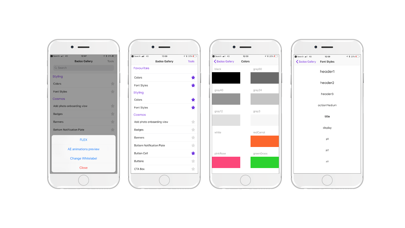
Every component might have many different states depending on the user input or on the intrinsic logic of the application. For example, a simple UIButton defines several states: default, highlighted, focused, selected, and disabled.
Curious? Check here for more information.
We also wanted to have the ability to present all the combinations in our gallery. We do this inside every specific screen for any component. Of course, our own versions of button can have different states from Apple’s UIKit button.
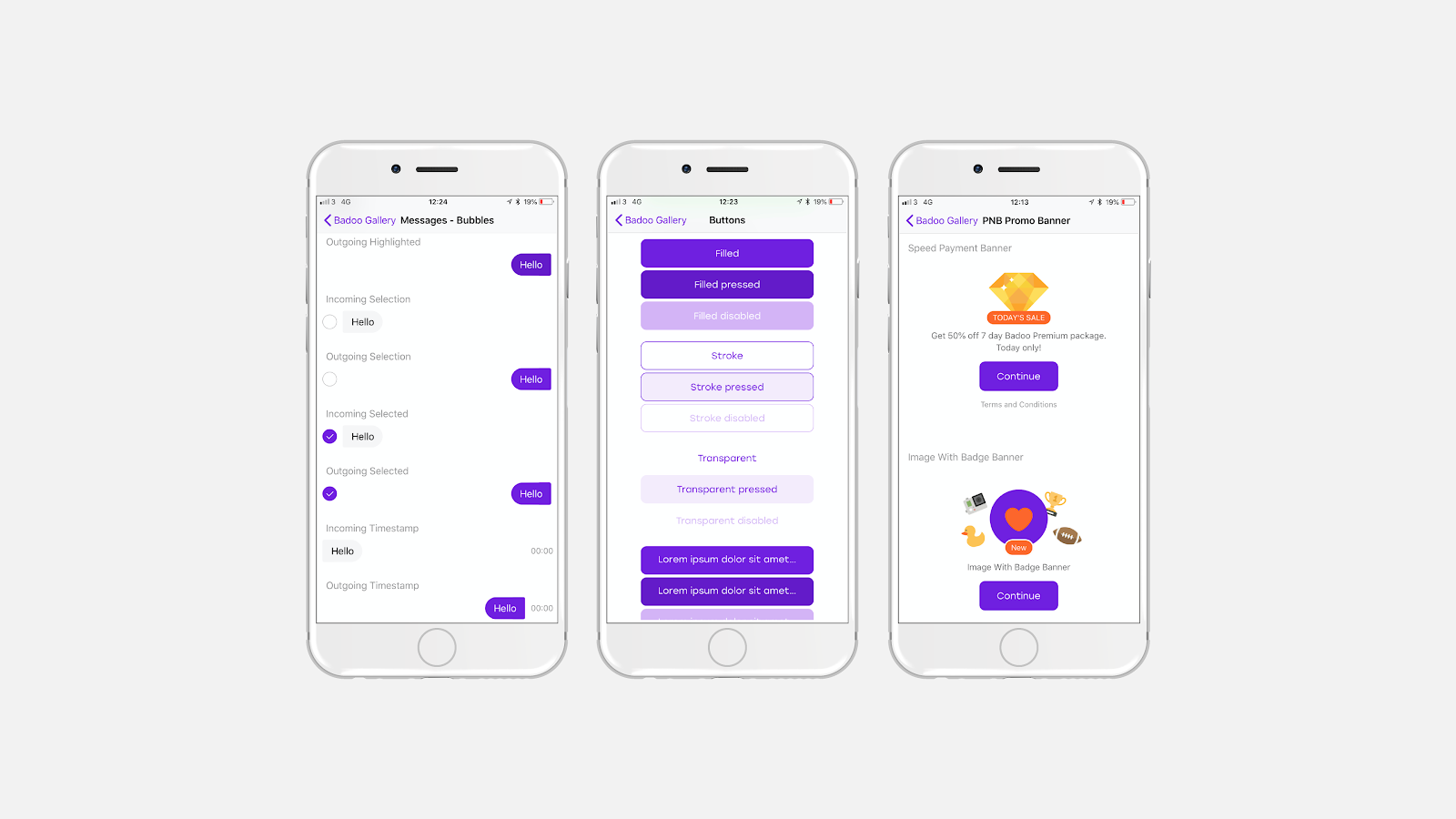
This is a summary of the main benefits of the Badoo Gallery:
- Lists all the UI components that we have implemented in iOS
- Easy search and find of UI components. Now everyone in our team or product team can see all the possible variants of a UI component and find new possible uses for them
- Being able to find easily components that already exist makes it much easier to convince a designer to re-use them
- The compilation time of a very small project like this gallery is very short. The development speed of the whole feature can be shortened by implementing the UI in this light application
- The favourites feature helps us to find the components that we are implementing at the moment
- Adding external tools like FPS, multi-brand and flex helps to understand, improve and measure the quality of the UI components we have in the catalogue
- All these components are now in a separate framework and presented in isolation. This makes them easily testable!
About Testing
Most of the initial problems listed in the article have been solved by introducing the new set of tools:

But there were still some issues that could be improved, other questions that needed answering: When making changes, how can we ensure that the UI will look as we expected after some changes? How can we avoid other parts of the application or other components being adversely affected when «sub-components» are modified?
A good way to find answers to all those questions is by adding tests to the UI components. There is already a lot of documentation out there on how to implement UI testing in iOS. There are also many different tools available for testing different aspects of the user interface of an application.
In Badoo we decided to start adding snapshot tests using one of the most popular «tools» around at the moment for snapshot testing: iOSSnapshotTestCase (formerly known as FBSnapshotTestCase because it was initially built and released as open source by Facebook).
Find more info about snapshot testing and this specific framework at the following links:
- https://github.com/uber/ios-snapshot-test-case/
- https://www.objc.io/issues/15-testing/snapshot-testing/
- https://ashfurrow.com/blog/snapshot-testing-on-ios/
We needed to find a way to test the components that we already had in BadooUIKit in order to avoid possible regressions while modifying the components being used by the rest of the app.
We also wanted to automate the process of adding a new snapshot test for a component as much as possible.
As explained earlier in this article, we also have a gallery application that lists all the components and all the different states that a single component might have. It’s very convenient because it allows the snapshot tests to be added using Badoo Gallery as the host application.
All the UI components implemented in BadooUIKit are stored in a class (repository or store pattern) that provides access to all the components. This Store can be instantiated both to present the list of components in the gallery as well as to access them from the snapshot test classes. This means that is not necessary to duplicate the work of instantiating and preparing the different states of every component in the testing level because this has already been done when introducing the component into the gallery app interface.
These are a few questions that might arise regarding snapshot testing. Allow me to provide some answers:
Where are the snapshot images stored?
We store them directly in the git repository. Initially we thought that it might inflate the size of the repository too much but it proved not to be too bad. In most cases we are not testing full screens but small components and so the screenshots are very lightweight. Currently our screenshots folder is around 11Mb which we consider acceptable.
Are all the possible resolutions in all the possible simulators tested?
No, the benefit wouldn’t be huge and it could cause numerous problems including flaky tests, a heavier snapshot folder and more difficulties in maintaining the test suite. We preferred to be pragmatic and only test the device most popular across our users. Our continuous integration system is also set up to use a simulator of the same device model used to make the snapshots.
Are snapshot tests sufficient to cover all the UI?
I don’t think so. At Badoo, we also have different kind of tests at different levels of the application, like for example functional tests (we use Calabash and KIF frameworks) and some integration tests. In my experience it’s important to find a good balance between the kind of tests and the amount of tests needed to satisfy the requirements of any application.
Lessons learned
Of course, during the build process of this new platform our company has learned many things and we are still learning with every iteration. All the above tools and processes were introduced in around a 12-months period and are still evolving. Until now, every single step has proved positive both for the developers and the company, and right from the start we started to see positive results. Here are some of the lessons we learned during this process:
- Moving all existing components at once is very big task, but creating the design system and encouraging the team to use it as part of the development flow increases the number of UI components step by step. Moving some components in every task that some developers implement not only automatically increases the number of UI elements in your system but also unlocks and releases some dependencies between existing elements. This facilitates the task of moving more and more components later on.
- We learned that designers are happy to reuse existing components, but is easier to convince them if we can demonstrate that we already have a totally functional component that behaves very similarly to what they need.
- The need to save time in mid-long term is a reality. We all know that at the moment, compilation times in Swift + Objective-C projects are not the best. The Badoo Gallery app is very light and it compiles very fast. We have learned that it’s much better to implement the UI components directly using the gallery app as playground and then just use them from the main application where the compilation times aren’t so fast.
- Having the components in a specific UIKit and a gallery application where we can easily test the components boosts the whole testing process and allows us to write tests more easily.
Going further — Cosmos
In Badoo we care about all of our features and we want them to have a unified and visually attractive user interface to give our users the best quality experience when using all our platforms. This why we are making global changes — with the help of the design and product teams — across the entire company, and implementing a design system named Cosmos.
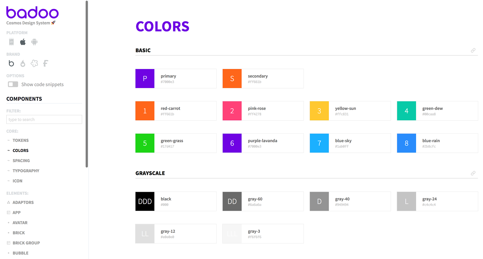
Cristiano Rastelli has written several interesting articles where he explains in detail how Cosmos came to life. Don’t miss them!
Acknowledgements
This project wasn’t a one-man job: the whole iOS team, including managers, developers and QAs, participated in one way or another. I have to thank all of them because I can say that they were all on board from the very beginning.
Thanks to the Badoo’s amazing design team who are always willing to go the extra mile when it comes to improve the design processes across the company.
Special thanks go to Alexander Zimin for multiple improvements and for his attendance at so many meetings on this process as well as for supporting me personally in this UI adventure. Also to Alyssa Ordillano for her excellent graphics that have greatly improved the accessibility of this article.
Автор: asantos
